The concept of responsive web design transformed the internet. It solved one of the biggest challenges developers faced during the rise of smartphones by allowing websites to adjust their layouts based on different screen sizes. Instead of building separate desktop and mobile websites, developers could create a single experience that responded to the user's device. For years, this approach became the standard for modern web development.
Today, however, users expect far more than a website that simply fits their screen. They expect fast loading times regardless of their internet connection, interfaces that respect their accessibility preferences, personalized content, smooth interactions across multiple devices, and experiences that feel tailored to their individual needs. Meeting these expectations requires a shift in thinking. Modern websites shouldn't just be responsive—they should be adaptive.
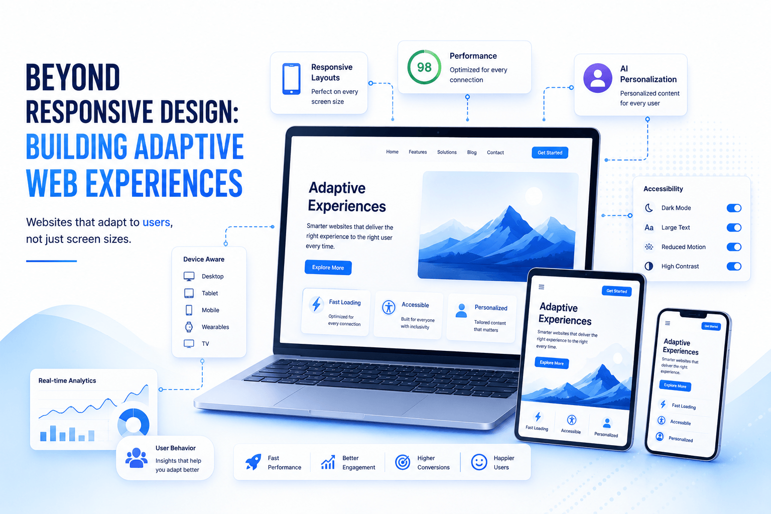
Adaptive web experiences go beyond rearranging layouts. They consider who the user is, what device they're using, how fast their connection is, whether they prefer dark mode, whether animations should be reduced, and even what they're trying to accomplish. Instead of delivering the exact same experience to everyone, adaptive websites intelligently adjust to provide the best possible experience for each visitor.
Responsive Design Solved Yesterday's Problems
When responsive design first emerged, its primary goal was straightforward: make websites usable on different screen sizes. Flexible grids, responsive images, and CSS media queries allowed layouts to adjust automatically whether someone was browsing on a desktop computer, tablet, or smartphone.
This approach dramatically improved usability and eliminated the need to maintain multiple versions of the same website. Businesses could reach customers across a growing range of devices while developers worked from a single codebase. It was one of the most significant milestones in modern web development.
Although responsive design remains essential, it only addresses one aspect of the user experience. A website may display perfectly on a mobile phone yet still perform poorly because it downloads large images, loads unnecessary JavaScript, ignores accessibility preferences, or assumes every visitor has the same capabilities and expectations.
Modern users expect websites to understand much more than screen dimensions.
Adaptive Experiences Focus on the User, Not Just the Device
An adaptive website asks a different question.
Instead of asking, "What size is this screen?" it asks, "What kind of experience will work best for this user?"
Two visitors may access the same website using identical smartphones, yet their ideal experiences could be completely different. One might have a high-speed Wi-Fi connection while another relies on a slow mobile network. One user may prefer dark mode, while another requires larger text or higher contrast to improve readability. Some users appreciate animations and visual effects, while others have enabled reduced motion settings for accessibility reasons.
Adaptive design recognises these differences and adjusts the experience accordingly. Rather than forcing every visitor into the same interface, it creates a website that feels more personal, accessible, and efficient.
This user-centered approach is becoming increasingly important as audiences become more diverse and digital experiences become more sophisticated.
Performance Should Adapt to Real-World Conditions
Website performance has become one of the most important factors influencing user satisfaction. Visitors expect pages to load almost instantly, regardless of where they are or what device they are using. However, delivering the same resources to every visitor often results in unnecessary delays.
Adaptive websites optimise performance based on real-world conditions. A visitor with a slower internet connection may receive smaller images, lighter JavaScript bundles, or fewer background animations. Someone using a modern desktop with a fast connection can receive richer visual experiences without sacrificing performance.
This strategy is particularly valuable for businesses serving global audiences where internet speeds and device capabilities vary significantly. Instead of creating separate websites for different markets, adaptive techniques allow one application to intelligently optimise itself for every visitor.
The result is faster loading times, lower bandwidth consumption, and a more consistent user experience across different environments.
Accessibility Is No Longer Optional
One of the most valuable aspects of adaptive web experiences is their ability to respect individual accessibility preferences automatically. Modern browsers and operating systems already provide users with settings that improve readability and usability, and websites should respond accordingly.
For example, many users enable dark mode to reduce eye strain during extended browsing sessions. Others increase text size or activate high-contrast modes to improve visibility. Some individuals prefer reduced animations because excessive motion can cause discomfort or distraction.
Adaptive websites recognise these preferences instead of requiring users to configure each website individually. By responding to system settings, developers create interfaces that feel more inclusive while improving usability for a much broader audience.
Accessibility should never be viewed as a feature for a small group of users. Nearly everyone benefits from clearer navigation, readable typography, faster interfaces, and thoughtful design decisions that make digital experiences easier to use.
Personalization Is Becoming Part of Web Development
Modern users increasingly expect websites to remember their preferences and anticipate their needs. Streaming platforms recommend relevant content, online stores display personalised product suggestions, and business applications remember recently used features.
Adaptive web experiences build on this concept by combining personalization with context. Rather than showing identical content to every visitor, websites can present information based on location, language, previous interactions, browsing history, or customer status.
A returning customer might immediately see recent orders or saved preferences. A visitor from another country could receive local currency and region-specific content. Someone browsing from a mobile device during business hours might be shown a simplified interface focused on quick actions, while desktop users receive more detailed dashboards.
Personalization should always improve the user's experience rather than becoming intrusive. When implemented thoughtfully, it creates websites that feel more helpful without overwhelming visitors.
Progressive Enhancement Creates Better Experiences for Everyone
One of the most effective principles behind adaptive web development is progressive enhancement. Instead of assuming every visitor has the latest browser or fastest device, developers begin with a solid foundation that works reliably everywhere. Additional features are then layered on for browsers and devices capable of supporting them.
This approach ensures that essential functionality remains available regardless of technical limitations. Users can still access important content, complete forms, or purchase products even if advanced animations, interactive components, or modern browser features are unavailable.
Progressive enhancement also improves long-term maintainability. As new web technologies emerge, developers can introduce improvements gradually without excluding users on older devices or unstable connections.
Rather than building websites that fail when advanced features are unavailable, adaptive design focuses on delivering the best possible experience within each user's environment.
Modern Browsers Provide Valuable Context
Today's browsers expose a wide range of information that allows websites to adapt intelligently. Developers can detect preferred color schemes, reduced motion settings, touch capabilities, screen orientation, viewport size, and language preferences without compromising user privacy.
These capabilities allow websites to make informed decisions about how content should be presented. Touch-friendly controls can appear automatically on mobile devices, keyboard navigation can remain a priority for desktop users, and layouts can adjust based on available screen space rather than relying on fixed assumptions.
Combined with responsive design, these browser capabilities allow developers to create experiences that feel natural regardless of how users access the application.
The goal isn't to create entirely different websites. It's to ensure every visitor receives an experience that feels appropriate for their situation.
Artificial Intelligence Will Make Websites Even More Adaptive
Artificial intelligence is introducing an entirely new dimension to adaptive web experiences. Instead of relying solely on predefined rules, future websites will increasingly learn from user behaviour and optimise themselves in real time.
AI can identify which content visitors engage with most, recommend products based on browsing behaviour, optimise search results, improve customer support, and personalise navigation without requiring manual configuration.
Imagine a business website that recognises whether a visitor is a first-time customer or a returning client and automatically adjusts the homepage to highlight the most relevant information. An e-commerce platform could reorganise categories based on previous purchases, while a SaaS dashboard might surface frequently used tools before the user even searches for them.
These experiences represent the next evolution of adaptive design, where websites respond not only to devices and preferences but also to user intent.
Businesses Benefit as Much as Users
Adaptive web experiences aren't simply about improving aesthetics or adding sophisticated features. They deliver measurable business value by creating faster, more accessible, and more engaging digital products.
When websites load quickly, visitors are more likely to stay. When interfaces respect accessibility preferences, more users can interact comfortably with the content. When personalization helps customers find relevant information faster, conversion rates often improve. And when adaptive techniques optimise performance across different devices and networks, businesses can reach wider audiences without maintaining multiple versions of the same application.
These improvements influence customer satisfaction, search engine performance, user retention, and operational efficiency. Adaptive design therefore becomes more than a development technique—it becomes part of an organisation's digital strategy.
The Future of Web Development Is Adaptive
Responsive design will always remain a fundamental part of web development, but it should no longer be considered the finish line. Modern digital experiences must adapt to far more than screen dimensions. They should understand user preferences, accessibility requirements, network conditions, device capabilities, and evolving expectations.
The web is becoming increasingly intelligent. As APIs, cloud computing, artificial intelligence, and browser capabilities continue advancing, websites will become more context-aware and personalised than ever before. Developers who embrace adaptive thinking today will be better prepared for the next generation of digital experiences.
Rather than asking how a website should look on different devices, modern development asks a much more important question: How can this website provide the best possible experience for every individual who visits it?
Final Thoughts
Responsive design changed how websites adapted to devices. Adaptive web experiences are changing how websites adapt to people. This shift reflects a broader evolution in web development, where success is no longer measured solely by visual consistency but by the quality of the experience each user receives.
Businesses that embrace adaptive design build digital products that are faster, more inclusive, and better prepared for the future. They create websites that respect accessibility, optimise performance, personalise interactions, and evolve alongside changing user expectations. As technology continues advancing, the most successful web experiences won't simply fit every screen—they'll intelligently respond to every user.
Share this article